People are certainly talking about BMW's updated logo. It debuted this week, along with the electric i4 concept vehicle. Personally, I like it because it subtly modernizes the brand and hints at the future evolution of their vehicle lineup and design language. As you might expect, it looks great on the i4 and a little less impactful on their current generation of vehicles. The car blog Jalopnik said BMW screwed up its logo design. Everyone is entitled to an opinion - there are some great comments - but I think it was a shrewd move on BMW's part. Instead of car bloggers, designers, and couch commentators talking (again) about the large kidney grills BMW insists on using, they are debating the merits of the new logo instead.
That logo chatter creates a lot of buzz which gets potential customers thinking about the brand. As a vocal BMW enthusiast - I tell everyone who can stomach it about my love for the i3, the only pure electric model BMW currently sells - I think this is great. And I do want to talk about a logo, just not BMW's.
Let's Talk About KIA.
Yes, that KIA. You may think that the only thing KIA and BMW have in common is a propensity for three letters company names. But, the Hyundai sub-brand that used to be associated with poor credit scores and dancing hamsters has quietly transformed itself into something new.
Beginning in 2005, Kia set its eyes on the notoriously hard to crack European market - where American manufacturers have had very mixed results. The Koreans, however, identified design as central to their European growth strategy, so they hired Peter Schreyer, the visionary behind the Audi TT - a vehicle Car Design News called "one of "the most influential automotive designs in recent time."
He set about creating a recognizable 'face' for the brand. The notched grill called the "tiger-nose" was integrated into every vehicle to create "a powerful visual signal, a seal, an identifier."
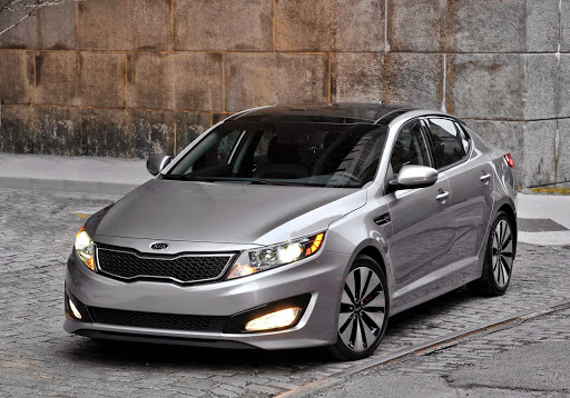
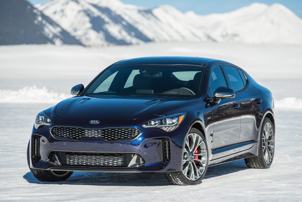
To me, the first sharp looking vehicle produced under Schreyer's watch was the 3rd Generation Optima. The Soul had character, but the 2010 Optima marked KIA's arrival as an eligible automotive debutante. Fast forward to 2020-21, and you won't find an ugly face in their lineup. I'd go so far as to say that the KIA Stinger is the best looking BMW 3-Series should you want to stick a blue and white badge on it. And although three-row SUVs leave a bitter taste in my mouth, I get why the Telluride's popular - it's palatial inside and has peerless value.
All this is a meandering way to get to what I want to talk about.
What The KIA Logo Signifies Today
The vehicles KIA sells today are nothing like the econoboxes they sold twenty years ago. Their cars look good, are a great value, and in top-level trim, are for many, a first foray into the entry-level luxury market. The only thing wrong with the $43,000 Telluride SX - other than the dearth of things to complain about - is the badge.
KIA drivers are swapping the factory badge on their cars for another one that looks more upmarket. It isn't too often that customers spontaneously decide that a rebrand is in order. There are always brand enthusiasts who evangelize or promote a product they really like. But in the case of KIA, the rebadging movement isn't just being done by rabid fans. Ordinary owners are posting how-to's and before and after photos of their rebadged Tellurides and Stingers in car forums the world over. Some even bring their vehicles into their dealer to perform the swap.
In economics and finance, arbitrage is the practice of taking advantage of a price difference between two or more markets. Right now, KIA is in an odd position; its customers assign a higher value to the brand than the brand ostensibly does. I can't recall any major corporation having a brand arbitrage problem before.
Usually, companies fight to stop brand dilution. Think luxury goods, where consumers have to learn how to spot fakes like notorious knockoff Louis Vuitton handbags.
But your brand can't dilute your brand. Right now, a sizable number of consumers are spontaneously "upgrading" their cars. I suppose this is one of the logical results of our modern-day hashtag world where companies routinely ask for user-generated content.
Spontaneous Brand Distillation
This novel situation for a car brand was, no doubt, made possible by the design decisions championed by Peter Schreyer, now continued by Luc Donckerwolke, and the technical prowess honed over twenty-plus years of car-making.
"I have had so many people stop and look at my car, wondering what it is. They see the KIA badge, and I can tell they lose just a little enthusiasm, but only a little."
- Cubby61 - USA
"The amount of times I've seen people in my rearview mirror mouth "What's a Stinger?" to their passenger, and then see the passenger whip out their phone to check."
- StingerGT68 - Australia
KIA is in an enviable position, vis-à-viz its brand identity. They have stylish cars that are appreciated by consumers and critics alike. And within that base is a collective desire for the brand to "level up." When design language alone causes a consumer to assume your product is upmarket, you're winning.
Design: The Way Forward
Looking back to 2006, KIA was right; design was the way forward. It is poised to reap the benefits of that hard work and should take the baton and run with it. Unlike the BMW rebrand, which is driven by a design lead vision forward that must pull and cajole their customers into that future, KIA's customers are craving a rebrand to exemplify what they already believe - that KIA belongs upmarket.
This development is quite special and indicative of the impressive strides KIA has made in car design and in raising consumer opinion of its brand.
Further Discussion on Brand Identity